
I’ve been using Pico.css for years on a lot of projects. Liveframe.app is even built with it. But I’ve had to hack on it quite a bit to get adjustable per-user theming, and it ends up being kind of heavy when you include all the colors. I wanted something a little more dynamic, and I’ve finally built it.
It’s called @sparkstone/css, and it’s built for people like me: folks who want semantic HTML, zero bloat, and a color system that actually makes sense when you start tweaking things.
This isn’t meant to compete with the big players. It’s not Tailwind. It’s not Bootstrap. It’s what I needed, and maybe you do too.
Why I Love Pico.css (And What I Needed More Of)
I’ve used Pico on a dozen projects. I love the simplicity of it, and how you can just start building things and rarely even need to reach for classes to adjust stuff. Honestly, I tried just making a fork of it to start with, Pico has almost everything I want. But over time, I kept running into the same issues:
- Wanting to use a specific color palette for special cases
- Wanting to be able to let the user choose their own theming
- Wishing I could just swap a base color and have everything update beautifully
- Needing a few more classes… but not that many
So after I realized that hacking on Pico was going to be harder than starting from a new foundation, I started designing.
Enter @sparkstone/css
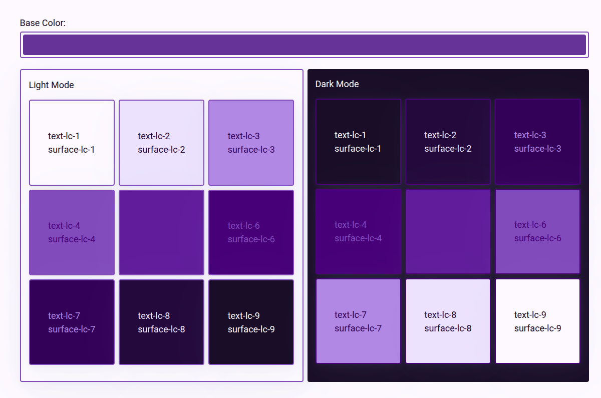
This project is heavily inspired by Pico, but rebuilt from scratch around oklch(). If you’ve ever struggled to tune your colors across light and dark mode, or wanted a theme system that actually reflects your palette’s structure—you’ll get why this matters. After I got the color system working, I built a page and put it side by side with Pico to get it close—like I said, I still love Pico.
Here’s how it works:
/* these are the defaults */
:root {
  --color: rebeccapurple;
  --primary-color: blue;
  --accent-color: oklch(from var(--color) l c calc(h + 180));
  --error-color: maroon;
}
That’s it. The rest cascades from there. Text colors, surface backgrounds, borders, shadows. All tuned based on perceptual lightness and chroma. You don’t need to invent a palette. You just pick a color, and everything adjusts accordingly.
What You Get
- ✨ Light/dark mode that works by default (system-aware, but overrideable)
- ✨ Minimal classes (
.card,.secondary,.ghost, etc.) when you need them (largely Pico-compatible) - ✨ Fully native HTML elements styled with care: forms, dialogs, buttons, etc.
- ✨ A Sass layer with functions for color derivation (but you don’t need it)
There’s no runtime. No JS required for the styles. Just smart CSS.
Try It Live
I put together a docs site using the framework itself:
🧪 sparkstonepdx.github.io/css/docs
Everything is copyable and live-styled with your chosen theme.
Install It
pnpm add @sparkstone/cssThen import it however you like:
// scss (for full control)
import '@sparkstone/css/src/theme.scss';

// or plain css
import '@sparkstone/css/theme.css';
I Made This For Me (But It’s for all of us)
I’ve spent years building local-first, minimal, durable tools, after outgrowing a decade of chasing the new shiny. Always reaching for libraries that almost worked the way I wanted. This one finally does.
If you’re like me, and you want your CSS to feel like it’s helping, and not just there, I think you might like it too.
I’d love to know what you make with it.
— Adam
Founder @ Sparkstone
Leave a Reply